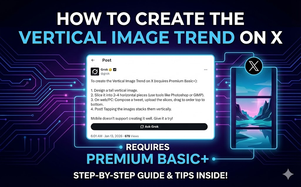
You've probably seen those posts on X where someone shares what looks like a random 2×2 grid of images, but when you tap it—boom—they line up into one tall, continuous picture. It's a neat trick that's been blowing up lately, and it's actually pretty easy to pull off once you know how.
Here's the deal: X displays multiple images differently depending on whether you're looking at the timeline or the expanded view. On the timeline, you get a grid. But tap the post, and the images can stack vertically. If you've sliced one tall image into pieces and uploaded them in the right order, they reassemble into something seamless.
Let's walk through how to actually make this work.
What's happening under the hood
When you attach 2-4 images to a post on X:
- Timeline shows them as a grid (2×2 for four images, side-by-side for two)
- Tap the post, and they display in a scrollable vertical stack
The trick is to take a tall vertical image, slice it horizontally into 2-4 pieces, then upload those pieces in order. When someone taps your post, they see your original image reconstructed.
People are using this for everything—tall artwork, comic strips, before/after reveals, infographics, you name it.
The catch: you probably need X Premium
Here's the part most tutorials gloss over. To reliably control the order of your images, you need the drag-to-reorder feature when composing posts. That's a Premium feature.
Without Premium, you can still post multiple images, but you don't get precise control over how they're arranged in the expanded view. Sometimes it works, sometimes it doesn't.
Also important: the reordering interface only works properly on desktop web. The mobile app doesn't give you the drag handles. So even with Premium, do this from your computer.
What you actually need
- X Premium Basic+ (for reliable image reordering)
- Desktop browser (mobile won't cut it for composing)
- A tall image to split (taller than wide—think 1:2 or 1:4 ratio)
- Something to slice it (we made a tool for this, or use Photoshop/GIMP if you prefer the manual route)
How to do it
1. Get your tall image ready
Start with something that's meant to be viewed vertically. Panoramic shots, tall illustrations, full-length portraits, infographics—anything where height matters more than width.
Quick tips:
- Avoid putting important stuff right where the cuts will be
- Think about how it'll look both as separate tiles AND as the final vertical image
- Keep text away from the edges
2. Split it into pieces
You can do this manually in any image editor, but it's tedious math. We built a free splitter tool specifically for this that:
- Shows you exactly how the grid will look on X's timeline
- Previews the "tap to see it" vertical view
- Exports numbered files (01, 02, 03, 04) so you know the upload order
- Runs entirely in your browser (nothing gets uploaded anywhere)
Just drag in your image, see the previews, download the ZIP.
3. Upload to X (from desktop)
Open X in your browser, start a new post, and upload the tiles in numerical order. If you have Premium, you'll see drag handles on each image thumbnail—use those to make sure everything's in the right sequence.
Add your caption and post.
4. Check that it worked
Look at your post in the timeline (should be a grid), then tap it. If the vertical stack looks seamless, you're good.
Ideas for what to post
The reveal effect: Grid looks like random pieces, vertical view shows the full picture. Works great for "zoom out" moments or "the full story" type posts.
Comics and visual stories: Each tile is a panel. Vertical view reads top to bottom like a comic strip.
Before/after: Stack them vertically. The scroll down becomes the transformation reveal.
Tall artwork: Artists are using this to display pieces that would get cropped badly in normal posts.
Infographics: Create a tall data visualization that teases key stats in the grid but delivers everything when expanded.
Things that can go wrong
Images in wrong order: Double-check before posting. The compose window shows you the arrangement.
Visible seams: Usually happens with manual cropping that's off by a pixel. Use a tool that calculates exact dimensions.
Nobody taps: The effect only works if people actually tap your post. Make the grid view intriguing enough to click.
Mobile posting doesn't work: Don't try this from your phone. Desktop web only for the compose step.
Common questions
Do I really need Premium? For consistent results, yes. The reordering feature is key, and that's behind the paywall.
How many images work best? 2 or 4. Two gives you a simple top/bottom split. Four (2×2 grid) is more popular and gives you more creative options. Three works but the grid layout gets weird.
What dimensions should my source image be? For 2 images: roughly 1:2 ratio (width to height) For 4 images: 1:2 or 1:4 ratio works well
No need to be exact—our tool handles any dimensions and shows you the result before downloading.
Will image quality suffer? Not if you use proper splitting tools. We extract tiles from your original without recompressing. What goes in is what comes out.
Why we built this tool
Look, you can do this manually in Photoshop. But calculating the exact pixel dimensions, making sure there's no rounding errors that create visible seams, doing the math for different grid sizes—it's annoying.
We wanted something where you just drop in an image, see exactly how it'll look on X (both timeline and expanded), and download ready-to-upload files. Plus it runs entirely in your browser, so your images stay on your device. No accounts, no watermarks, no weird limitations.
Give it a shot: oneimage.co/split/twitter-tap-to-see-it
Other tools that might help
If you're putting together vertical image posts regularly, you might also want:
- Resize — Get your source image to the right dimensions first
- Crop — Frame the composition before splitting
- Squoosh — Shrink file sizes if they're too large for X
- Overlay — Add watermarks or branding
All browser-based, all private.
The bigger picture
Trends come and go on social media. This particular vertical image trick might be everywhere right now and forgotten in six months. But the underlying idea—using platform quirks creatively to make content that stands out—that's always going to matter.
X shows images a certain way. If you understand how, you can make posts that grab attention in a feed full of noise. That's really all this is.
---
Questions? Found a cool use for this? Drop us a line at support@oneimage.co.